LOGO
Logo Color
Logo Black & White
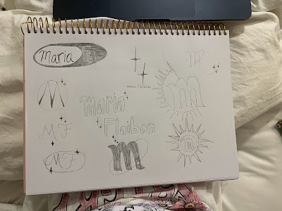
Sketches
For this project, I used Adobe Illustrator to create a personal logo. I decided to do a monogram logo, very basic and simple without many elements included. The logo is supposed to be similar to an orbit, with the moon, stars, and my first name initial in the middle. To create the M and the stars I used the pen tool to make the drawings. I also used the eclipse shape to make the orbit and the circle tool for the moon. I made the stroke of the orbit and the moon to 3 point, so it would be bold and noticeable. I decided to implement a neutral color palette for the logo, so it would be discreet and give off a relaxing and calm tone to it. I also used the shape builder tool in order to connect my shapes to one another and make the logo into one single shape.
I decided to use my initial for this logo because I have the same name as my great-grandmother that passed away a few years ago. I hold a very special place for her in my heart, and my name is a constant reminder of the great women she used to be and the women I aspire to be every single day. The orbit with the stars also has a significant meaning to it; since me and my sister were little, we used to love to sit and watch the night sky at night, it was always a bonding time for me and her, and up to this day we carry on with this tradition. I have a sun tattooed in my left wrist and she has a moon tattooed in her right wrist, which explains the moon in the orbit. The logo I created incorporates some of the most important people in my life and it is a visual representation of who I am as a person.


Comments
Post a Comment